Design Guidelines
Designing custom athletic or cycling apparel graphics can be very different from other forms of media. We encourage you to take the time to look through the following tips and pointers.
LOGOS, GRAPHICS & IMAGES
All logos and artwork should be in vector format (Illustrator .ai or Freehand .eps). A vector graphic retains its clarity when it is scaled for different sizes.
Non-vector graphics, known as raster images, do not retain clarity when scaled and will become pixelated or blurry.
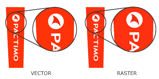
It's important to note that raster images placed into Adobe Illustrator and then saved as an .ai or .eps file are still raster images. They will not scale or print clearly.
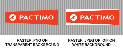
USING RASTER IMAGES
If you must use raster images in your artwork, they should have a minimum of 250 dots per inch (dpi) at actual jersey size (which is approximately 7000 pixels wide across the chest).
They should also be saved on a transparent background as a .psd, .png, .ai or .eps file format. Raster images saved as a .tif, .gif, .jpeg, or .psd will always print with a white background.
If the color in your raster image needs to be exact (just as our "rorange" needs to be exact), a color print of the raster image should be sent to your account manager so we can match as closely as possible.
USING LOGOS
Logos can be used on your clothing so long as you have written permission from the sponsoring company.
Pactimo logos will appear on your garments in the locations demonstrated in the Garment Design Templates. See the Logo Standards Guide for more information about Pactimo logo placements and color options.
TIPS TO CONSIDER WHEN DESIGNING YOUR GARMENTS
- Black on printable Lycra, such as that used in shorts and bibs, will appear as a dusty black when the fabric stretches on the body. Therefore, it's a good idea to avoid printed black areas directly next to non-printed black areas, as they may not look like similar shades of black.
- All white or light colored rear panels on shorts/bibs will be more transparent than darker color-filled panels.
- Gradients and fades used with red colors will take on a pink hue as the color lightens.
- Very steep gradients between light and dark colors may actually appear as if there are lines separating the colors.
- Full black on shoulders of garments can be very hot in certain climates.
- Small graphics or text crossing the top or bottom of the rear pockets requires meticulous alignment when the garment is sewn. It's better to slightly raise or lower the graphic so that it does not intersect at the pocket to avoid possible misalignment.
FONTS
Make sure to convert all your text to outlines in Illustrator or include your font files. Otherwise your fonts may be automatically converted to something you don't like or want.
COLORS
Colors print differently on cloth than they do on paper. Even Pantone® colors may not print exactly. That's why we've created Pactimo Fabric Color Swatches.
Pactimo Fabric Colors are code as PAC XXX. They have been perfected over time and when referred to, ensure an exact color match. Download the Color Swatch file (2.22MB).
MATCHING COLORS IN DESIGN
When you download one of our Garment Art Templates for use in Adobe Illustrator, you will find a Pactimo (PAC) color swatch library embedded into the template. Apply the PAC colors according to the colors you have chosen from the Fabric Color Swatches.